User:Previously Unsigned/Image Tips
From Guild Wars Wiki
Jump to navigationJump to search
Below, I have listed some tips on getting the best quality images for Guild Wars 1 and 2. Nothing style wise, just technically. I tried to cover everything.
First things[edit]
- -bmp command appended to your game or you fail. When Guild Wars outputs JPEG images (the default), they are heavily lossy compressed and I can see the difference. When using BMP, you get bitmap images with no compression at all. If you cannot see the difference then you are too used to them or probably not looking close enough. You should be able to see the difference if you play the game a lot (jpegs lead to unsaturated text in highly saturated areas for one).
- All graphical effects on, even supersample and ultra shadows in Guild Wars 2. It only takes a couple seconds to turn on all effects and it can make a huge difference. Everybody is going to be looking at your images so why not provide the highest quality ones? Most cards can handle max settings good enough for a still objects, which is mainly what we do here. There's no movement or chaoticness lowing your FPS even further. Only thing I turn off is Depth Blur in Guild Wars 2
Editing[edit]
- I recommend working in Photoshop, Paint Shop Pro, The GIMP, or Paint.NET. These are all better than Microsoft Paint at making JPEGs (paint is basically the quality of GW2's built in JPEG engine).
- If you are retouching your photos in ANY way, for the love of God, calibrate your monitor first. And even if you aren't retouching anything, you should still do it. All monitors, even high end, have flaws out of the box. Usually too bright, too blue (typical of LCDs), so what you're seeing is not accurate and you can't know what you're doing or seeing. Some downplay the issue but those people usually don't have calibrated monitors and shouldn't be speaking at all so they don't know what they're missing. Everybody should be calibrated. At least do it so your neutrals are actually neutral. And it is basic color management - achieving consistency between devices/mediums. Even if your monitor is on it's way out, a monitor profile is better than nothing. I suggest a php Spyder4 Pro colorimeter or X-Rite ColorMunki Display] or [ColorMunki Smile]. Don't use your eyes, the visual system is easily fooled and you can't be 100% sure when you have the color balance just right.
- If you are having trouble getting your calibrated monitor profile to show up while playing Guild Wars in fullscreen, I wrote a guide on how to force it using Powerstrip.
- If you are sharpening an image, I prefer to do it only on the lightness channel. You can do this two ways: convert from RGB to LAB mode, then select the lightness channel and sharpen that (then convert back to RGB when finished everything else). Or, in Photoshop, you can sharpen as normal and immediately after choose Edit/Fade unsharp mask (or whatever filter you used) and then apply it only to the luminosity channel. Can also control opacity too here. Either way method avoids color shifts and halos that you might run into with sharpening. I use a simple unsharp mask, at 50%, 1.0 radius, 1 threshold.
Saving[edit]
- When saving your images, use a Save For Web feature. Why? Finer control over quality, easily compare original and compressed versions, and it removes unneeded metadata to save space. It is built into Photoshop and can be installed in The GIMP with this plugin. If I find a Paint.NET version, I will post it. Also, 300% minimum zoom please when comparing versions. Just because you can't see the artifacts at 100% doesn't meant they aren't there. And when you get used to 300% you can see the differences at 100%.
- IMPORTANT TIP: If using Photoshop, remember to uncheck "Convert to sRGB" in Save for Web options. It may change the look of the image and considering that Guild Wars uses no embedded profiles (bmps are not tagged with anything), it's unnecessary.
Other things[edit]
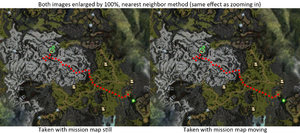
- Guild Wars 1: If taking an image of the mission map, move it around around a little bit or walk a little until it "snaps" into place. The mission map can otherwise have a blurred effect. Here's an example:
- Guild Wars 1: If taking images of weapons or armor (like for dye charts), do it in the dye preview window or Llye's window. Both of these have undistracting backgrounds and nice, neutral lighting. I do it in the larger UI size too, it shows the most detail.
- Guild Wars 2: If taking images of weapons or armor, do it in the Hero window. It also has an undistracting background and avoids post processing effects getting in the way. Making the UI size larger offers no benefit.
- If I'm using compression on an image, I write 95% or SFW 95 when I upload it. It's not necessary but I like to tell how much they are seeing compared to the whole.
