Guild Wars Wiki talk:Projects/Dye charts
Thoughts?[edit]
So it's something I think that could really benefit the community. Whilst I can work on a lot myself it would be a task that is beyond just one person. I started typing up all the different items that would be needed but then I thought it would be best to see what others thought of it first before moving on (see the axe page for a rough outline). At the moment it's a very early draft and a lot of fine tuning would be needed (I'm not exactly "up" with wikicodes). The format has mainly come from the Weapon models project, and I've tried to adapt it to purpose. The project would cover not only weapons, but also "Miscellaneous" items such as Equipment packs (bags, belt pouches, etc.), Festival Hats, etc. The project could also expand to the armor area (such as the some of the Common armor dye charts I've already done) and maybe possibly have a dye chart for each set of armor art. Of course this whole project would require a dye chart formatting guide of some sort to be created. Well, thoughts? Mystical Celestia 06:33, 8 July 2009 (UTC)
- Any project that proposes to increase the amount/accuracy of information we present has my vote. -- Wyn
 talk 07:32, 8 July 2009 (UTC)
Page style suggestion[edit]
This may be trivial, and not really pertaining to the project itself, but might I suggestion you use the {{yes}} and {{no}} templates, rather than the specific x and check images? So your options would be ![]() ,
, ![]() , and
, and ![]() . The
. The ![]() is a bit overpowering. -- Wyn
is a bit overpowering. -- Wyn ![]() talk 07:32, 8 July 2009 (UTC)
talk 07:32, 8 July 2009 (UTC)
- The big red X does seem overpowering so unless any one feels like there's another alternative I'll go back and change them. How about the
 icon? Do you think that should to be replaced too? (Just figured out how to do that without typing the whole image path too!) Mystical Celestia 07:59, 8 July 2009 (UTC)
- The big red X does seem overpowering so unless any one feels like there's another alternative I'll go back and change them. How about the
Categorizing images[edit]
You should be adding the proper categorization to the dye chart images, either Category:Armor dye charts or Category:Weapon dye charts. Makes it easy to see all the dye charts we have. -- Wyn ![]() talk 05:24, 22 July 2009 (UTC)
talk 05:24, 22 July 2009 (UTC)
- All the newly uploaded ones have the Category:Weapon dye charts attached to them. Most of the current ones need the charts updated so when they are re-uploaded they will have the tag added to them (I've outlined it in the Tutorial, but forgot in the guidelines). I'm not sure why the Ancient Axe one didn't have the category added though (it shows it in the comments part :S). Mystical Celestia 05:44, 22 July 2009 (UTC)
Multiple dye charts[edit]
What should we do with items that have more than one dye charts? For example, I found for Holy Rod(just loot, not collectors version) 2 versions of dye charts and a non dyable version. Should we post both versions on the item page? Should we do more research, to see if there is a pattern for where each version is dropping? --Sharkinu![]() *Ding!* 16:09, 18 September 2009 (UTC)
*Ding!* 16:09, 18 September 2009 (UTC)
- Do they have more than one dye chart because multiple peopole uploaded, or does the item have two variations where the dyable area changes? If the first, we should just pick the better looking chart. ~Shard
 02:10, 19 September 2009 (UTC)
- Two diffrent dye charts. Usually is a dye charts with normal colors and a dye chart where the item is turning lime when using yellow dye. I think that might be a pattern, like one version drops in one campain and one version in another campain, but I need to do more research. Oh, and I'm talking actually about items not about dye charts already uploaded on wiki.--Sharkinu
 *Ding!* 04:59, 19 September 2009 (UTC)
- So far for weapons with two dye charts I've just included both charts. For instance the Ascalon Razor has a separate dye scheme for the collector version and the Traveler' version so I just included both under a different section. Usually it's collector/weaponsmith variants that dye differently to drops (or they can dye when loot ones can't). Haven't really worked out a method for recording that information, so I usually just try to word them like the Protective Icon's page. ~Celestia 00:02, 20 September 2009 (UTC)
- Two diffrent dye charts. Usually is a dye charts with normal colors and a dye chart where the item is turning lime when using yellow dye. I think that might be a pattern, like one version drops in one campain and one version in another campain, but I need to do more research. Oh, and I'm talking actually about items not about dye charts already uploaded on wiki.--Sharkinu
It was Holy Rods that got me started checking for multiple dye effects, but now I have a fairly long list going with several items which seem to have multiple dye effect possibilities. User:LicensedLuny/Core Skin Dyeability (see the talk page for individual drop examples.) I'm so glad to see there is already a standard in place for dealing with the multiple dye chart items! :) As I get data and good examples together, I'll use these as examples to follow. For cases where there are different dye effects between loot versions (like Holy Rods - it's not just loot vs. collector! http://img190.imageshack.us/img190/6096/compareyellowholyrod.jpg) are there any naming conventions for the two dye chart files? LicensedLuny 04:00, 27 April 2010 (UTC)
Individual Todo List[edit]
First of all, there are a lot of items missing from this list. Someone should look through all the weapon categories and add the missing ones.
I have access to ALL of the pvp weapon skins, and I am going to get to all of them eventually. I'm setting up a page which will list the pvp skins that currently do not have dye charts. Please add to it if you find a pvp skin without a dye chart. ~Shard ![]() 06:48, 13 December 2009 (UTC)
06:48, 13 December 2009 (UTC)
- Just a word of warning though, some PvP weapons may have a different dye scheme to those of PvE skins. Similar to how the Flame Artifact (flame), from different campaigns, react differently to dye. ~Celestia 03:31, 23 December 2009 (UTC)
- I highly doubt anet would make new dye maps for existing items in a pvp update, but I will keep a look out for discrepancies. ~Shard
 03:34, 23 December 2009 (UTC)
- I highly doubt anet would make new dye maps for existing items in a pvp update, but I will keep a look out for discrepancies. ~Shard
Armors[edit]
I did a few for elite armors, and plan to do more covering non-elites as well, but I only saw weapons listed on the main page. As far as the armors go, I'd like to continue adding if it helps.--*Yasmin Parvaneh* ![]() 19:49, 22 December 2009 (UTC)
19:49, 22 December 2009 (UTC)
- Add sections for it. ~Shard
 19:56, 22 December 2009 (UTC)
I would like to help too but atm I'm cash strapped. Black + white dye should be a crime at those prices. Previously Unsigned 21:16, 3 January 2010 (UTC)
- You dont have to use the dyes. Just print screen the preview window.
- What I mean is in order to get the preview window with a dye you need one of the dyes in the first place. Previously Unsigned 23:26, 3 January 2010 (UTC)
- Oh, and question. We make dye charts only for the chest piece or for each of the 5 pieces for each armor?--Sharkinu
 21:27, 3 January 2010 (UTC)
- It's better if you make it for all pieces, but if you can only do one, do the chest piece. I'll end up getting to all of them and doing full set charts eventually. ~Shard
 21:57, 3 January 2010 (UTC)
- Well, I just tried making a "fake" dye chart by screenshotting each piece separately and then layering them. Not that hard but time consuming! To make sure the poses lined up exactly I copied one image and then lined up the feet or mouth - those parts usually don't move that much so are good guidelines. It looks pretty seamless if you ask me, and I guess I'll try doing one this way (or at least for black and white dyes) and see how long it takes. Can save a ton of money but you pay in time. Here's an example: http://img237.imageshack.us/img237/1672/dyechartcomposite.png Previously Unsigned 06:19, 8 January 2010 (UTC) DOH - I just noticed that you had notes about that on the tutorial part on your page? I thought you were just loaded and dyed each piece and took a final screenshot at the end with them all already dyed. Previously Unsigned 06:31, 8 January 2010 (UTC)
- It's better if you make it for all pieces, but if you can only do one, do the chest piece. I'll end up getting to all of them and doing full set charts eventually. ~Shard
One more question if anybody doesn't mind. Are we doing dye charts of things like pvp masks? Such as imposing mask - no armor associated with it. Previously Unsigned 23:20, 9 January 2010 (UTC)
Dye Icons[edit]
Surely anyone bothering to consult the dye charts as opposed to using dye themselves would have realised that silver was released before gray and therefore silver would be on the left of B&W and gray on the right? Seems a bit trivial to need to use text, as often the dye vial seems more concise. Also if people without photoshop wished to help, the text goes a bit skew-if meaning that probably more people could help if they did not have to use text labels. [ or would you all prefer that unlabeled images are uploaded and you could affix the text to them? e.g.--File:User Chieftain Alex Chieftain Signature.pngChieftain Alex 11:07, 13 February 2010 (UTC)
- I don't see how when a dye was "released" has anything to do with this. The labels are used because they are 100% clear what colour it is. You can't get "Silver" mixed up with "Gray" when it's written right there. Another reason include some people don't do dye charts using the dye preview box, and take the SS in the real-game environment, where looking at the background of the dye-preview box cannot be done. I don't see how someone can include dye vials in the chart yet not have the capabilities to include text. Also you don't have to use Photoshop. Hell, I've done dye charts using MS paint and MS publisher before.
- If you want to continue using the dye vials, that is fine, but the guidelines are there to have a consistancy between the dye charts and that is how they are evaluated. Also your images seem to be a bit blurry, ensure you use 4x anti-aliasing, high resolution, -bmp command line and high graphics settings. ~Celestia 12:22, 13 February 2010 (UTC)
- Thanks for the tip off on the blur - really had little clue what aliasing was before I looked it up.. I don't think this would solve the problem of the text I use becoming blurry though - I may just leave the shots without names and within the userspace.--File:User Chieftain Alex Chieftain Signature.pngChieftain Alex 20:09, 13 February 2010 (UTC)
Can there be a note on...[edit]
having the user interface to "larger"? It's near resolution. It zooms windows to their maximum possible so you can see more detail. See this quick comparison (thumbnail): 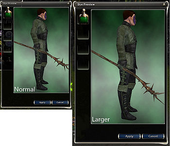 Previously Unsigned 07:37, 14 February 2010 (UTC)
I also just thought... shouldn't there be a set number of rows? Since 12 could be 6x2 or 4x3 or 3x4... that woudl help for consistency too. Previously Unsigned 07:55, 14 February 2010 (UTC)
- Seems an excellent idea - I've started using larger UI size and combined with anti-aliasing apparently the screenshots are a better quality :) --File:User Chieftain Alex Chieftain Signature.pngChieftain Alex 12:32, 15 February 2010 (UTC)
- Yes using larger is good, but just because they are taken at a larger size, uploading them at that size isn't always a good idea. As long as the users cna see what's affected, that is suffice.
- In regards to columns and rows, well it's pretty hard to have a set grid when some charts would look horrible using a set (say 4x3) in-game dimensions (i.e. weapons like File:Heraldic Shield dye chart.jpg, File:Aureate Lamp dye chart.jpg and File:Ascalon Battle Staff dye chart.jpg would make the page stretch). And while those charts are good 6x2, other charts would look horrible as 6x2. ~Celestia 13:37, 15 February 2010 (UTC)
Monk Flowing Armour[edit]
I have just made a dye chart for Female monk flowing armour, could someone look over it and make sure it is all correct - I will be a doing a few over the next couple of weeks and want to make sure that the layout etc was right. Paranon 22:54, 5 March 2010 (UTC)
Sooo... (Pink dye)[edit]
Slowly remaking all dye charts with the new pink dye?--Sharkinu![]() 20:07, 16 October 2010 (UTC)
20:07, 16 October 2010 (UTC)
- I was thinking the same thing too! Too bad my other hard drive with most of my saved PSDs isn't working otherwise I'd add pink to them. Fucking sleep/standby mode. Anyways, where would we put pink anyways? After the last color? And now with 13 colors, we're going to have a whole row practicly empty. Previously Unsigned 23:18, 18 October 2010 (UTC)
- Given that the pink dye won't be available to all players, could we add the pink dye preview as a separate image to be loaded next to the main dye chart? That might help avoid the whole issue of how to make a decent looking summary image from 13 shots, too. I dread the stream of questions in a few months when people who missed the npc start asking where to get the pink dye. :/ Maybe it would be more clear that pink is a special case if they're kept in a separate image? But some skins get amazing results, and lots of players are stocking up on pink. Earth Wands and Water Wands turn pure white with the new pink! :o LicensedLuny 00:49, 20 October 2010 (UTC)
- I like this idea.--Sharkinu
 07:38, 20 October 2010 (UTC)
- So how DO you put an image next to a dye chart? I have tried it and it does NOT work. It always makes a new line instead. And what about a template? Anybody? Previously Unsigned 04:54, 24 October 2010 (UTC)
- I am still new to all this helping but as default armor is now always gray and the dye remover has been replaced by gray can we not just substitute the default section for pink, that way we get to keep our 12 section grid --SleepyGamer 16:42, 21 November 2010 (UTC)
- I can see a couple issues with that. First, it changes the standard for existing dye charts and makes them all need to be retaken. Second, the default/gray color is one of the options for coloring armor, so I think it should be included in the shots for completness' sake. Third and finally, I still think it's a mistake to include pink with the colors normally available on demand to every player. I just suspect it will cause unnecessary confusion and waste folks' time looking for pink dye when they can't get it. :( However, I am nowhere near facile enough with wiki code and templates and such to have even a clue how to go about leaving a second spot on the dye chart template for a lone pink shot to appear next to the 12 shot main chart. LicensedLuny 02:25, 22 November 2010 (UTC)
- I am still new to all this helping but as default armor is now always gray and the dye remover has been replaced by gray can we not just substitute the default section for pink, that way we get to keep our 12 section grid --SleepyGamer 16:42, 21 November 2010 (UTC)
- So how DO you put an image next to a dye chart? I have tried it and it does NOT work. It always makes a new line instead. And what about a template? Anybody? Previously Unsigned 04:54, 24 October 2010 (UTC)
- I like this idea.--Sharkinu
- Given that the pink dye won't be available to all players, could we add the pink dye preview as a separate image to be loaded next to the main dye chart? That might help avoid the whole issue of how to make a decent looking summary image from 13 shots, too. I dread the stream of questions in a few months when people who missed the npc start asking where to get the pink dye. :/ Maybe it would be more clear that pink is a special case if they're kept in a separate image? But some skins get amazing results, and lots of players are stocking up on pink. Earth Wands and Water Wands turn pure white with the new pink! :o LicensedLuny 00:49, 20 October 2010 (UTC)
Now that pink dye is available for everyone, should we start adding it to dye charts? Maybe instead of gray, because gray doesn't drop? Linu 12:36, 4 October 2011 (UTC)
Could we set some naming conventions and get a wiki pro to update the dye chart template?[edit]
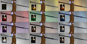
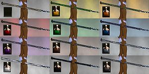
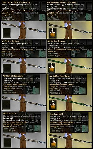
Ok, so in addition to the pink dye issue above, there are cases where the exact same skin may have different dye effect. The thumbs here are one example from my project page where I've been working on such curiosities - core skin Air Staffs have two different ways they can dye. (I'm trying to start getting pictures together and uploaded for that page, but I'm slow.) I can't find any way to predict which way the thing will dye from where or when it dropped or from the inventory icon. It's not just this skin - I've found several things that do this. So for such situations, we'll need two dye charts. I think it would also be good to have the pink dye preview in a separate image file. So ...
- Is there some naming convention we could use for
- items with more than one dye effect overall,
- the pink dye preview images?
- Should we try to retake full dye charts if we're uploading new pink images to have consistency with the character seen in the shots, or should we leave existing dye charts as-is and upload pink shots even if they don't quite match the character and style of the main dye chart?
- Could the dye chart template used on weapon pages be updated to automatically include multiple dye effect charts and pink preview shots if they're available? Could it also include some warning note which appears when there is a pink preview shot ... something that warns people pink dye is not generally available in game and links to the appropriate article explaining why? If so, could someone facile with wiki make those changes to the template? I have no clue how to mess with templates and such. I'd rather see any changes to the template handle cases where there is still only one dye chart image available gracefully instead of leaving ugly broken links around.
I like the idea of the pink preview shot appearing as a smaller thumbnail to the right of the main 12-image dye chart. I would think cases of multiple dye effects should have the different versions on separate lines. Agree, disagree? If no objections, any ideas for file naming convention and/or how to get the template set up? I mean no offense to anyone by using the vials instead of the English words for the colors. I like the vials better than words, and earlier on this page there seemed to be agreement that using vials instead was acceptable. LicensedLuny 05:45, 9 December 2010 (UTC)
- I like words for colors better than vials because usually the dye chart is resized by the dye chart template and this (plus a badly confiured display) could make it hard to say which dye is gray and which is silver for example. With words there is no confusion.
- For weapons with multiple dye charts I think we should name the files like this: Ascalon Razor. So should be like: File:Weapon Name (collector) dye chart.jpg or File:Weapon Name (tyrian) dye chart.jpg
- And for pink dye, IMO a separate thumb is better than remaking all charts.--Sharkinu
 19:07, 9 December 2010 (UTC)
- I opt for vials instead of colors because I don't like making documentation language-specific unnecessarily. Also, I do dye charts with Paint. While it is possible to put text with Paint, there's no option to make the text background invisible. I figure on a full dye chart it's not hard to see silver vs. gray because one will be noticeably darker. I think you can always click the thumb on the dye chart template to get the full-size image. Anyway, there's no reason we can't agree to disagree on letters vs. vials, right?
The trouble with the Ascalon Razor naming convention is that some cases of multiple dye effects are cases where one version comes from some collectors and the other version comes from other collectors (Ele offhands are like this.) Some cases are both versions can occur on seemingly identical gear like the Air Staff example thumb I left here. So in cases like that, would we name one dye chart like "Air Staff (core default) dye chart.jpg" and another like "Air Staff (core green) dye chart.jpg"? I'm fine with it if so - I'd just like to make sure I understand what is an isn't ok. LicensedLuny 22:30, 9 December 2010 (UTC)
- I opt for vials instead of colors because I don't like making documentation language-specific unnecessarily. Also, I do dye charts with Paint. While it is possible to put text with Paint, there's no option to make the text background invisible. I figure on a full dye chart it's not hard to see silver vs. gray because one will be noticeably darker. I think you can always click the thumb on the dye chart template to get the full-size image. Anyway, there's no reason we can't agree to disagree on letters vs. vials, right?
- You make baby Jesus cry! Ditch the Paint! Paint.NET or The Gimp have so much better JPEG engines. (Plus I have a bunch of imaging tips on my user profile) GW JPEGs are already highly compressed and desaturated. You're killing me here! Also, the black should be easy to remove. Pretty sure they have a magic eraser.
- In terms of putting the pink next to the normal dye chart, I tried that a long time ago and it wasn't currently possible unless somebody does some coding. Also why I separated them was due to it being a rare dye too. So I think they should be split still.
- Names vs dye icons: this was discussed a long time ago because people were confusing the dye color icons as well! So really, the only best way would be to include both, like
 Power Leech <---that. Really though standardizing dye order also fixed some of that problem. A third solution would be to have the words only but colorized as well, but then people could confuse that too.
 - Personally, I'm not a fan of large icons like in yours. I like them to be as minimal as possible. They are like captions after all.
- Different dyeability is so bizarre! I would suggest labeling them where they were obtained, like (collector) name at the end or well, some way to point to their origin. If no origin could be identified or it was random, then maybe a (variant 1), 2, 3 etc at the end would. Just my opinion. Previously Unsigned 23:50, 9 December 2010 (UTC)
- I am sorry for the great stress that my use of Paint causes you! I swear I don't intend such offense. However, I am not going to find, install, learn and use new software in order to make dye charts of GW weapons when I'm happy with the results I get from something which comes pre-installed. If the consensus is that my images are so atrocious, then I'll keep them just on my own little project pages rather than trying to link them on the skins' main articles.
- I agree that the different dyeablity is bizarre! It's one of those weird things about GW which manages to be extremely frustrating and incredibly curious at the same time ... I can't help but find such things keep me interested in this game. ;) If it were as easy as, "Option 1 happens on collector gear. Option 2 happens on loot," that would be great. But that is not the case AT ALL, as you can see from that picture of the four "Air Staffs." There's also the possibility on a lot of this stuff that an otherwise identical item won't dye at all. So I think the variant 1 and 2 suggestion for naming convention works best. In general, I'd lean towards variant 1 being for the things where yellow dye tends to make something look green and variant 2 being for yellow dye makes default. It seems more likely that items from Prophecies areas dye the first way so far.
- Since it seems we're all in agreement that a pink shot next to the main dye chart is the ideal solution, I've asked if a pro can help us hax up the template. LicensedLuny 02:00, 10 December 2010 (UTC)
- They aren't that bad to learn or install. They are pretty pick up and go! That's mostly why I suggest them in addition to being free. I'd give them a try. what's the worst that can happen? anyways, good thing about asking somebody to fix that pink thing too. It's been bugging me for a while! Previously Unsigned 15:38, 10 December 2010 (UTC)
- You make baby Jesus cry! Ditch the Paint! Paint.NET or The Gimp have so much better JPEG engines. (Plus I have a bunch of imaging tips on my user profile) GW JPEGs are already highly compressed and desaturated. You're killing me here! Also, the black should be easy to remove. Pretty sure they have a magic eraser.
Armor dye charts[edit]
Hi! I'm adding some armor dye charts. I've been reading the guidelines and this talk page and I know it would be better if I dyed the whole armor, but I can't do that at the moment. Feel free to delete them if you want to upload a better version or if you don't like them, of course. I'm just doing it because I think it's useful for the users to see how they look in all colors (last time I wanted an armor, I spent two days googling how it looked in white before buying it and maybe there are more people like me). BTW, I can stop doing it if it's wrong, but I didn't know who to ask. --The preceding unsigned comment was added by User:Linu (talk).
- Don't worry - only producing a chart for the chest piece is perfectly normal and an accepted way of doing this, the only thing I would suggest is you also do the default colour (remove the dye from the dye preview window after opening it and also gray dye) - like you did so perfectly for the weapon dye charts. --File:User Chieftain Alex Chieftain Signature.pngChieftain Alex 12:05, 10 September 2011 (UTC)
- Well, gray and default are the same color in armors, aren't they? I didn't include them because I had read it was better not to do it, but I can do it! Thanks for the help. Also, I need to find a way to remember to sign my comments! Linu 12:17, 10 September 2011 (UTC)
- Turned out I noticed under Guild_Wars_Wiki:Projects/Dye_charts/Guidelines#Expanded_guidelines that you don't have to inclue gray dye on armors :/ sorry for being misleading. Can replace the gray slot with pink now though right? :D File:User Chieftain Alex Chieftain Signature.pngChieftain Alex 16:13, 8 October 2011 (UTC)
- Well, gray and default are the same color in armors, aren't they? I didn't include them because I had read it was better not to do it, but I can do it! Thanks for the help. Also, I need to find a way to remember to sign my comments! Linu 12:17, 10 September 2011 (UTC)
Pink Dye (pt 2)[edit]
So now that we all have easy access to pink dye we should probably include it in the dye charts produced from now on - would the order now be for weapons:
default, yellow, orange, red, green, blue, purple, brown, silver, white, black, gray and then pink? --File:User Chieftain Alex Chieftain Signature.pngChieftain Alex 16:13, 8 October 2011 (UTC)
- I asked the same question a few days ago, but I think we shouldn't include gray dye in the charts and replace it for the pink one. The reason is that gray doesn't drop. Other option could be remove the default because it's already in the dye description, but I prefer to remove the gray. If we put them all, we'll have 13 dyes in the picture and that looks too... unprofessional (but that's my opinion) In fact, I would put the dye chat in this way: default, yellow, orange, red, green, blue, purple, pink, silver, white, black, brown (or maybe brown before silver). It looks much better. Linu 13:53, 15 October 2011 (UTC)
- I'm definitely in favor of keeping the 12 from the original scheme :/ File:User Chieftain Alex Chieftain Signature.pngChieftain Alex 20:38, 15 October 2011 (UTC)
