User:Wendy Black/Lab01
| Home |
Heroes |
Defenders |
Talk About It |
Miscellaneous |
|---|
Menu Bars[edit]
| Menu 1 | Menu 2 | Menu 3 | Menu 4 | Menu 5 |
|---|
Blended Test Menu.
I use Gimp to get the Hex number values of each color. But the color is worked out like this;
Red = #FF0000
Green = #00FF00
Blue = #0000FF
Here is Green to Yellow
| Menu 1 | Menu 2 | Menu 3 | Menu 4 | Menu 5 |
|---|
To add a graphic use Image; then set the position using the span tag. Top:-30px moves the image up 30 pixels. Left:-60px moves it left 60 pixels.
| Menu 1 |
Menu 2 |
Menu 3 |
Menu 4 |
Menu 5 |
|---|
Now the same menu but your images added afterwards. Notice the menu is thinner? The images are outside the cells.
| Menu 1 | Menu 2 | Menu 3 | Menu 4 | Menu 5 |
|---|
More about color codes[edit]
Mixing color on a PC is different than what we were told in art class. This is because we are painting with light. If I shine a RED light on a white wall you get a RED shadow. If I shine a GREEN light on the same wall my shadows will be Red and Green but the overlapping shadows will be Orange or Yellow. So when you add #FF0000 (full intensity red light) with #0000FF (full intensity green light) you get #FF00FF yellow. My hubby tried to explain the number system used and it messed with my head. 00 is no light and FF is full intensity. I just use the Gimp to find the hex code. For others who want to find the color code there is a neat webpage app here.
Image Scale by Percentage.[edit]
| 50 Percent | 25 Percent | 15 Percent | 10 Percent |
|---|---|---|---|
 |
 |
Obviously a math formula something that could be done using a template...
In this template you need to specify 3 items; image, original size (width), and width in percent.
Some users might want to stick to a certain page resolution. Not all browsers are the same width and this is why the percentage comes in handy making the most of a given width of the pane. In this example, I give the pixel as the width for the table. The table no longer sizes to the browser width.
| 300 Pixels | 150 Pixels | 75 Pixels | 37 Pixels |
|---|---|---|---|
 |
 |
 |
Assuming that everyone uses your screen and browser settings will make your pages look either narrow or over hang making them scroll to the right depending on the viewer's settings.
Text Shadows and Blurs[edit]
User Thon Ghul Talk brought this up in my talk page.
Using Span style, "text-shadow" allows you to put a shadow of the current text behind it, but on top of the background. It is easy to use as a simple elegant shadowing effect. Adding a text-shadow allows you to have an outline around the text so that it blends in with your background, but is more visible. Check out these simple examples;
Shadows
- Code = <span style="font-size:2em; color:black; text-shadow: 2px 2px green;">Shadows</span>
Shadows
- Code = <span style="font-size:2em; color:black; text-shadow: 2px 2px 5px green,2px 2px 5px green;">Shadows</span>
- font-size:2em; Increases the size of the font.
- color:black; Is the font color.
- text-shadow: 2px 2px green; This created the simple shadow offset 2 pixels right and 2 pixels down and color green.
- text-shadow: 2px 2px 5px green,2px 2px 5px green; This created 2 shadows one on top the the other but blended out 5 pixels to the background.
Shadow Depth
- This shadow gives the 3D illusion on depth. Like the letters are floating above the page, and players ask why I play mesmers...
Motion Blur
- Code = <span style="display: block; text-align: Center; font-size:2em; color:black; text-shadow: -6px 0px 4px #555555,-12px 0px 4px #666666,-18px 0px 4px #777777,-24px 0px 4px #888888,-30px 0px 4px #999999,-36px 0px 4px #AAAAAA,-42px 0px 4px #BBBBBB;">Motion Blur</span>
- This text is centered using span.
- Then I added 7 shadows all travelling to left at -6 pixels per jump ending at -42 pixels.
- All the shadows are blended into the white background by 4 pixels.
- The shadows are shades of gray starting at the darkest #555555 to the lightest gray #BBBBBB
Cool Shadows
- This one I had some math help, my son helped me figure the curve. I used a gradient color from red to purple. The math of this curve is the x value is subtracted by 5, 10, 15, 20, etc.. The y value is subtracted the opposite by 14, 12, 10, etc.. In the end, it is up to the individual as to what pleases your eye the best.
Row and Column Span & Nested Tables[edit]
Start by drawing out a rough idea of how you want the information displayed. Using Rowspan gobbles up the number of rows below. While Colspan eats up the columns to the right. In this example; Data about Bob covers 2 columns by 4 rows. Then Bob's Picture covers 4 rows but only the one column.
| Characters | Players I Know | My Guild | Talk Page |
|---|---|---|---|
| Bob the Warrior | Data about Bob | Bob's Picture | |
| Fred the Mesmer | |||
| Joe the Necromancer | |||
| Sally the Ranger | |||
| My Awards | |||
Notice how the image distorts the size of the 5th row. This can be fixed by thinking ahead and adding empty rows for future expansion. Then you change the rowspan from 4 to 10.
| Characters | Players I Know | My Guild | Talk Page |
|---|---|---|---|
| Bob the Warrior | Data about Bob | 
| |
| Fred the Mesmer | |||
| Joe the Necromancer | |||
| Sally the Ranger | |||
| My Awards | |||
Remember, images can be scaled but will not be scaled by the table.
Nested tables are tables inside a single cell of another table. Here a new table 2x7 is placed inside the cell containing Bob's Data.
Templates[edit]
Templates are used to do redundant formats or calculations over and over again. Templates are setup on a separate page never to be accessed directly. Probably the thing that confused me the most is the variables. My hubby explained it to me like this; If you have a box of 8 apples and write on the box the word "oranges", that won't make the apples become oranges. You get exactly what comes out of the container. Oranges is only the variable name, so oranges + oranges = 16 apples. Variables are identified in the message you send to the template. Then the template returns the format with that data. Here below is an example of a template I made for user Yoshida Keiji.
| Upgrades | Settings | |||||||||
|---|---|---|---|---|---|---|---|---|---|---|
| Weapon | HCT (x2) HSR (x1) +30HP | Staff: 40/20/+30HP | ||||||||
| Health Energy | 580HP & 86E | |||||||||
| Build | Fire Magic 12+1+1 Energy Storage 12 |
OgBCoMzDugWgMAG9C6WTbsC
| ||||||||
| Usage | no comments |
This is the template code saved at; User:Wendy Black/SampleTemplate but if you go there you see nothing. Edit and you will see the contents below.
<includeonly>
{|{{STDT|blue|+=}}
!{{{CharImg}}} || Upgrades || Settings
|-
| '''Weapon''' || {{{WUG}}} || {{{WSET}}}
|-
| '''Health Energy''' || {{{HUG1}}}<br>{{{HUG2}}} || {{{HSET}}}
|-
| '''Build''' || {{{BUG1}}}<br>{{{BUG2}}} || {{{BSET}}}
{{ Skill bar
 | 1 = {{{S1}}}
 | 2 = {{{S2}}}
 | 3 = {{{S3}}}
 | 4 = {{{S4}}}
 | 5 = {{{S5}}}
 | 6 = {{{S6}}}
 | 7 = {{{S7}}}
 | 8 = {{{S8}}}
 | size = 24
 | outline = 1
 | border = direct
 | text = hide
}}
|-
| '''Usage''' || {{{USE}}} || {{{COMMENT}}}
|}
</includeonly>
Notice there is another template inside this template called "Skill bar" and I am able to pass data to it using variables S1 to S8. This is the code on this page;
{{User:Wendy Black/SampleTemplate
|CharImg=[[File:AcolyteSousuke-icon.jpg]]
|WUG=HCT (x2) HSR (x1) +30HP
|WSET=Staff: 40/20/+30HP
|HUG1=[[File:Rune_All_Minor.png|25px]]Vitae (x2) [[File:Rune_All_Minor.png|25px]]Attunement (x1)
|HUG2=[[File:Rune_All_Sup.png|25px]] Sup Vigor [[File:Radiant_Insignia.png|25px]]Radiant (x5)
|HSET=580HP & 86E
|BUG1=Fire Magic 12+1+1
|BUG2=Energy Storage 12
|BSET=OgBCoMzDugWgMAG9C6WTbsC
|S1=Fire Attunement
|S2=Aura of Restoration
|S3=Glyph of Lesser Energy
|S4=Meteor Shower
|S5=Rodgort's Invocation
|S6=Searing Flames
|S7=Liquid Flame
|S8=Glowing Gaze
|USE=[[File:Guard.png]]
|COMMENT=''no comments''
}}
Math in Templates[edit]
There are a few math templates on the wiki already. So I am just going to explain those instead of making something new. The first is call age and calculates age from current date to years and remaining days. So if you wanted to let people know your exact age...
59 years and 134 days is Wendy's current age (or close enough)
This will keep updating without me having to make daily edits to this section.
This is the code for age, I have made comments as what each line does. It also contains another template called Datediff (short for date difference) which is also listed below.
<includeonly>
{{#vardefine:days|                 <!-- This is that empty box we write the word "days" on, remember the apples in oranges box? -->
{{Datediff|{{{1}}}}}}}             <!-- This is the template we send our data to, it returns a value in the box marked days. -->
{{ #ifexpr: {{#var:days}} > 365 |  <!-- Question: Has more than 1 year passed? -->
<!-- Answer: Yes, then divide days by 365 rounded, and use days modulus 365 for the remainder. -->
{{ #expr: {{int div|{{#var:days}}|365}} }} years and {{ #expr: {{#var:days}} mod 365 }} days |
<!-- Answer: No, then no math needed just show us days. -->
{{#var:days}} days }}
</includeonly>
This is the code for Datediff and from the looks of it, this grabs the time off the server and subtracts our time given from that value. It divides by 86400 (seconds in a day) and rounds off to zero.
<includeonly>
{{ #expr: ( {{ #time: U | {{{2|{{LOCALTIMESTAMP}}}}} }} - {{ #time: U | {{{1|{{LOCALTIMESTAMP}}}}} }} ) / 86400 round 0 }}
</includeonly>
I don't see where they made any math for leap year. Every 4th year the calendar adds 1 day in February such as this year of 2012 and we have 366 days. So my age above should be reduced by 11 days (46 div 4). I guess whoever wrote the code wasn't that concerned with being accurate.
A better and somewhat fuzzy version of this would be;
- 59 years 4 months is Wendy's current age.
- Code
<includeonly>{{Trim|
{{#vardefine:days|{{Datediff|{{{1}}}}}}}
{{#vardefine:years|{{#expr: {{int div|{{#var:days}}|365}}}}}}
{{#vardefine:months|{{#expr: {{int div|{{#var:days}} mod 365|30}}}}}}
{{#var:years}} {{#ifexpr: {{#var:years}} > 1 | years | year }} {{#var:months}} {{#ifexpr: {{#var:months}} > 1 | months | month }}
}}</includeonly>
Maps Interactive and Non-Interactive[edit]
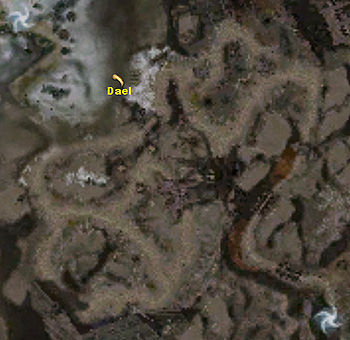
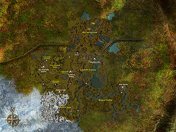
Over on the Well of Souls page you can see my WIP on this subject. The wiki is pretty good about having images for us to use. It is a real plus, when I don't have to make up images, and just use an existing one. Like this map below;
However what if I want to add clickable areas on the map or labels that just don't exist? Most wiki tutorials talk about the "imagemap" tag. It doesn't work on this wiki. This wiki uses a template called image label and a complex decimal system that flew right over my head. So I am working around it on my own. In this section I will show you how I work around to accomplish my goal.
| Column for Map | Column for my key |

|
A. Point of Interest B. Don't go here! C. You are here A B C |
My Example
![]()
The text "My Example" is offset text, A, B, and C on the map are just offset shadows, while the necromancer icon is an offset image. All of these, except the shadows, can be linked to other files and pages.
Q: Why not just add these to the map and upload a new image?
A: Things can change often in the game and this is easier to edit than adding a ton of unused images to the wiki.
