User talk:That Sounds Risky/Archive 022308-080508

Armor Icons[edit]
Hey, thanks for uploading all those icons. But when you uplaod armor icons, tag them with the profession's armor icon category tag. Like a warrior headpiece would go into Category:Warrior armor icons. Thanks, Calor ![]()
- I knew I'd forget something, should be fixed now. That Sounds Risky 04:33, 23 February 2008 (UTC)
- Thanks. It is. Calor
 04:35, 23 February 2008 (UTC)
- i know i'm late, but yeah, thanks :) CTRL + V
why don't you add your name to the project? Even if you won't contribute later days to it, your uploads helped a lot so far. —Zerpha The Improver 00:52, 23 February 2008 (UTC)
- i know i'm late, but yeah, thanks :) CTRL + V
- Thanks. It is. Calor
[edit]
Umm, I guess thanks for partly finishing what I started... User:Rappy/todo My wife got in a car accident and I haven't been on here much to finish it. — Rappy 15:37, 26 February 2008 (UTC)
- I'm sorry to hear that, and I apologize for stepping on any toes. You are of course free to fix/repair them how you like since they're really yours anyway. |
 Sounds Risky | 02:08, 27 February 2008 (UTC)
- Nah, no toe stepping, I was gonna sign in and work on them and realized they were done. If you wish to continue, go right ahead, still trying to find time to get to work on them. — Rappy 06:47, 1 March 2008 (UTC)
Inventory icons task force icon[edit]
Wow, that looks great! May i use this for the userbox template? —Zerpha![]() The Improver 20:42, 2 March 2008 (UTC)
The Improver 20:42, 2 March 2008 (UTC)
- Sure, go right ahead. | Sounds Risky | 22:12, 2 March 2008 (UTC)
- ok, thanks —ZerphaThe Improver 22:34, 2 March 2008 (UTC)
- ok, thanks —Zerpha
Rage of the Sea icon[edit]
Hey, thanks for updating the skill icon with a more consistent and nicer looking image. I could only do the screenshotted option, though it didn't really match.. so thanks for the quick response fixing it. - THARKUN ![]() 07:33, 9 March 2008 (UTC)
07:33, 9 March 2008 (UTC)
your image uploads[edit]

That's impressive! You are very active in uploading pics, "normal" ones as well. You also seem to be adepted in Image Rendering (already noticed that when you uploaded some weapon icons for greens).That looks neat. Do you use Photoshop? And how did you get an equipped appearance of the Blood Knive without the character's hand disguising parts of it? —Zerpha![]() The Improver 14:02, 11 March 2008 (UTC)
The Improver 14:02, 11 March 2008 (UTC)
- The knife was actually equipped. After taking a screenshot I brought that image into Photoshop and cut out the background, then drew over the hand with a tool called the Clone Stamp to approximate how the handle would look. | Sounds Risky | 18:21, 11 March 2008 (UTC)
- :O you faked the image? bad risky! ...hmmm, but tbh, i do not see this in the slightest. I wish i could photoshop that good...well but i'm perhaps to lazy to lern it :P —ZerphaThe Improver 19:25, 11 March 2008 (UTC)
- :O you faked the image? bad risky! ...hmmm, but tbh, i do not see this in the slightest. I wish i could photoshop that good...well but i'm perhaps to lazy to lern it :P —Zerpha
Your "Character Armor infobox"[edit]
Yours is better than mine.^^ (i included the armor piece names in my version, to make the icons recignizeable faster) But yours looks amazing, it looks much better at all... —Zerpha![]() The Improver 14:08, 11 March 2008 (UTC)
The Improver 14:08, 11 March 2008 (UTC)
correct brightness for skill icons[edit]
When i answered to your Accelerated Growth question, i noticed that you are able to give the skill icons their correct brightness. All the icons i uploaded for the historical content are actually too dark. :( Nobody apparently was bothered by this, but it's sometimes really too dark. (Just noticed you already uploaded some of them :D) May i ask how you color the transparent icons from gw.dat? I'm using photoshop and replace the transparency with black color. But that doesn't produce the best outcomes :P —Zerpha![]() The Improver 11:48, 3 April 2008 (UTC)
The Improver 11:48, 3 April 2008 (UTC)
- I too noticed that the icons appeared to be too dark and that details wouldn't showed up, so I took a screenshot of some of the icons as they appear in-game and tried to match their clarity in Photoshop. After opening an icon image from the DAT I would first set the layer as the background with the background color set as black so I'd get an opaque image without any transparency. I'd then adjust the gamma to 1.5 in the levels window to bring up the midtones without touching the light or dark parts of the image. I would finally raise the saturation of the image by 25 to bring back the color that was lost when the gamma was changed. This seemed to closely mimic how the icons showed up in-game so I then created an action to automate the process to ease up the entire thing since there's nearly 1,900 icons in the DAT. | Sounds Risky | 17:05, 3 April 2008 (UTC)
- ok, It took some time until i figgured out how to do this, but i think i did everything right, thanks :) —ZerphaThe Improver 20:40, 3 April 2008 (UTC)
- and here a direct comparison with your method (though idk how to automate the process :P):
- ok, It took some time until i figgured out how to do this, but i think i did everything right, thanks :) —Zerpha
mine (.jpg quality saved as "middle"(lvl 5) -> 
 <-yours —Zerpha
![]() The Improver 20:49, 3 April 2008 (UTC)
The Improver 20:49, 3 April 2008 (UTC)
- That looks pretty good, though I wouldn't use Photoshop's normal saving function for the final output and would instead use the Save for Web & Devices function. I've been saving the images from there at 80 optimized quality and they retain near-original image quality and rarely go above 6KB. I am trying to upload quality versions of at least all of the profession skill icons and have managed to get through necromancers and ritualists so far, and I'll probably get to the assassin icons next. | Sounds Risky | 21:04, 3 April 2008 (UTC)
- nice tip, i'll try this out.Additionally, great to hear you are going to re-upload high quality versions of all those skill icons :D —ZerphaThe Improver 13:26, 4 April 2008 (UTC)
- nice tip, i'll try this out.Additionally, great to hear you are going to re-upload high quality versions of all those skill icons :D —Zerpha
- That looks pretty good, though I wouldn't use Photoshop's normal saving function for the final output and would instead use the Save for Web & Devices function. I've been saving the images from there at 80 optimized quality and they retain near-original image quality and rarely go above 6KB. I am trying to upload quality versions of at least all of the profession skill icons and have managed to get through necromancers and ritualists so far, and I'll probably get to the assassin icons next. |
Icons[edit]
Any special reason you are uploading new versions of skill icons? - anja ![]() 22:48, 4 April 2008 (UTC)
22:48, 4 April 2008 (UTC)
- Most of them are badly compressed and blurry/lack detail. | Sounds Risky | 22:50, 4 April 2008 (UTC)
- Ah, I see. Go on then, ignore me ;) - anja
 22:51, 4 April 2008 (UTC)
- Just wanted to get all the Dervish icons finished first before explaining a bit more. Bascially I want to see a consistent quality between the skill icons, and the best way to do it is to put them all through the same process of compression, etc. You can check the Necromancer, Assassin and Ritualist icons I've put up so far. | Sounds Risky | 23:17, 4 April 2008 (UTC)
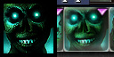
- I really dislike the new icons. They are too sharp, have high contrast and less detailed (a good example: this compared to the old one. The colour of the faces on the new revision is clearly changed, sharpening and brightening was pointless). Because of these, they tire eyes very quickly (seeing all of them at the same time just makes it worse) and just do not match the wiki's soft colours. Please consider reverting / reuploading the images, I would recommend using GWDatBrowser to extract skill icons and not to modify them afterwards (since the game uses those images, the wiki should use the same ones). 91.83.9.5 16:37, 9 April 2008 (UTC)
- Correction: some of the icons look quite good. However, I still advise to review your icons instead of batch processing. Most of Prophecies and some Factions skills are blurry compared to the newer ones. While the previous ones may need the sharpening / contrasting etc, the latter does not because it makes them look oversharpened, etc (see above). 91.83.9.5 17:06, 9 April 2008 (UTC)
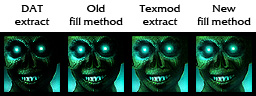
- None of the icons were sharpened. After pulling the icons out of the DAT their gamma was brought up to increase the midtones because for whatever reason the icons would simply appear too dark and lack detail. The whole point of batch processing is because the game isn't (or shouldn't be) finessing each individual icon, and so far I've extracted 1,986 unique icons out of the DAT and even then I'm still missing several.
- "Raw" icon extracted directly from the DAT →

- As far as re-uploading, I'm not going to because this has been an incredibly frustrating and awful experience so far. | Sounds Risky | 19:39, 9 April 2008 (UTC)
- So no other modifications were made, I see... I understand that you want to make it standardized, but some of the icons really.. well, worse than the old ones. Reverting is still a way to go, but it's up to you. 91.83.9.231 20:25, 9 April 2008 (UTC)
- What about asking other users that uploaded icons how they proceeded getting their color intensivity and brightness? —ZerphaThe Improver 20:29, 9 April 2008 (UTC)
- Mysterious IP user, I want to thank you. You made me re-evaluate the look of the icons. I finally got the Texmod program and extracted a few icons from there since the program seems to extract images differently than the DAT browser. After going over things I think I've finally come up with a new method for it that doesn't even alter any color settings. The real issue now would be to re-upload the 880 "fixed" icons I've already done, heh.
 Again, thank you for noticing that something didn't look right. | Sounds Risky | 07:56, 13 April 2008 (UTC)
- Ah, I also thought that Texmod could possibly work as the icons have a slightly diffrent coloring there. Nice to hear it worked now :D (yet i can't see any diffrence between the Tesmod extract and your new fill method :P) —ZerphaThe Improver 08:03, 13 April 2008 (UTC)
- I'm glad you found the solution:) I didn't know about GWDatBrowser / Texmod difference, the latter always seemed a bit more difficult to extract icons with, but it clearly looks better. Good luck with the uploading then. 91.83.21.182 17:38, 15 April 2008 (UTC)
- Extracting the file directly from the gw.dat gives the direct, and unprocessed sources; TexMod only has access to loaded textures. Depending on the settings it is likely that the textures are a bit changed in the game. Another possibility is that there might be a different color profile is used but TexMod extracts them as normal sRGB files. poke | talk 00:21, 8 July 2008 (UTC)
- I believe it might actually have to do with the DAT Browser saving the files as PNGs which to my understanding don't use alpha channels, while it appears the icons were originally a format like TGA or TIFF and look to be using the channel. But that's only an assumption. | Sounds Risky | 00:24, 8 July 2008 (UTC)
- I believe it might actually have to do with the DAT Browser saving the files as PNGs which to my understanding don't use alpha channels, while it appears the icons were originally a format like TGA or TIFF and look to be using the channel. But that's only an assumption. |
- Extracting the file directly from the gw.dat gives the direct, and unprocessed sources; TexMod only has access to loaded textures. Depending on the settings it is likely that the textures are a bit changed in the game. Another possibility is that there might be a different color profile is used but TexMod extracts them as normal sRGB files. poke | talk 00:21, 8 July 2008 (UTC)
- Ah, I also thought that Texmod could possibly work as the icons have a slightly diffrent coloring there. Nice to hear it worked now :D (yet i can't see any diffrence between the Tesmod extract and your new fill method :P) —Zerpha
- What about asking other users that uploaded icons how they proceeded getting their color intensivity and brightness? —Zerpha
- So no other modifications were made, I see... I understand that you want to make it standardized, but some of the icons really.. well, worse than the old ones. Reverting is still a way to go, but it's up to you. 91.83.9.231 20:25, 9 April 2008 (UTC)
- Just wanted to get all the Dervish icons finished first before explaining a bit more. Bascially I want to see a consistent quality between the skill icons, and the best way to do it is to put them all through the same process of compression, etc. You can check the Necromancer, Assassin and Ritualist icons I've put up so far. |
- Ah, I see. Go on then, ignore me ;) - anja


.png)
- Er, PNG has alpha. The PNGs I extracted from the dat myself looking for the map icons have alpha. Maybe I have a different program? God knows I'd like one that just extracted EVERYTHING so I could go over it with a REAL image browser, becuase I'm sure not ever going thourgh 40,000 unnamed files ever again and I know I missed things ^_^. --Star Weaver 20:40, 8 July 2008 (UTC)
- Are you sure it has an alpha and not just transparency? All of the PNGs I pulled from the DAT Extractor had transparency but not an alpha channel. When I first tried using PNGs with Texmod the icon images were completely broken, but when I switched to TGA for testing, the icons actually had an alpha channel in them. But come on, trying to find your way through 40,000 unnamed files is LOADS of fun! | Sounds Risky | 20:48, 8 July 2008 (UTC)
- Are you sure it has an alpha and not just transparency? All of the PNGs I pulled from the DAT Extractor had transparency but not an alpha channel. When I first tried using PNGs with Texmod the icon images were completely broken, but when I switched to TGA for testing, the icons actually had an alpha channel in them. But come on, trying to find your way through 40,000 unnamed files is LOADS of fun! |
- Er, PNG has alpha. The PNGs I extracted from the dat myself looking for the map icons have alpha. Maybe I have a different program? God knows I'd like one that just extracted EVERYTHING so I could go over it with a REAL image browser, becuase I'm sure not ever going thourgh 40,000 unnamed files ever again and I know I missed things ^_^. --Star Weaver 20:40, 8 July 2008 (UTC)
←← Hmm; i'm fairly sure that PNG has RGBA 32 bit foo. But not all the DXT formats do, one has explicit 1 level alpha and such. That have anything to do with it? I'll take a better look at the files later, anyway. --Star Weaver 21:34, 9 July 2008 (UTC)
Air of Enchantment[edit]
You forgot to add golden border, it's an Elite skill ;) —Zerpha![]() The Improver 05:58, 9 April 2008 (UTC)
The Improver 05:58, 9 April 2008 (UTC)
- Or perhaps he has obtained enlightend knowledge; the border is not part of the icon but an overlay, used only on the skill bar. Backsword 04:41, 29 June 2008 (UTC)
Armor[edit]
Can i borrow that really cool armor box you made for my user page? — Renuro Seru ![]() Talk 17:12, 29 May 2008 (UTC)
Talk 17:12, 29 May 2008 (UTC)
- Have at it, not sure how user-friendly it would be to modify though. | Sounds Risky | 23:23, 29 May 2008 (UTC)
Uploading Spree[edit]
What's the purpose of this one? More standardization? Calor ![]() 02:32, 8 July 2008 (UTC)
02:32, 8 July 2008 (UTC)
- You can check the icons discussion a bit further up the page where someone pointed out my goof in the original images, so I'm working on fixing the ones I had borked and will hopefully continue with the rest of the professions once it's done. | Sounds Risky | 02:35, 8 July 2008 (UTC)
- They look indeed nicer :) Brighter but not flashy (Just thinking of the paragon icons :P), clear but neither too blurred nor too sharp. —ZerphaThe Improver 21:12, 9 July 2008 (UTC)
- They look indeed nicer :) Brighter but not flashy (Just thinking of the paragon icons :P), clear but neither too blurred nor too sharp. —Zerpha
WTB Border[edit]
1 ~ Kurd![]() 22:20, 10 July 2008 (UTC)
22:20, 10 July 2008 (UTC)
Signature image[edit]
Hey Risky, your current signature image is too wide.. With our current signature policy, we only allow 19x19px (max) for signature images. poke | talk 13:34, 12 July 2008 (UTC)
- too bad, looked nice actually :P —ZerphaThe Improver 17:29, 12 July 2008 (UTC)
- Bah! I'll go try to find something else shortly.
 Sounds Risky | 19:20, 12 July 2008 (UTC)
- Mursaat related, eh? "Old" gold signature with accordingly colored icon. That's also nice :) But why didn't you simply use the "regular single version" of the previous margonite image? Do you prefer rather unique icons for your sig? —ZerphaThe Improver 20:50, 12 July 2008 (UTC)
- I had wanted to make a full image using that Abaddon icon for awhile, but I felt cropping it after would lose the visual flare of it. So I went ahead to the old standby of those fun Mursaat, and with their golden armor it seemed like a good fit for a color swap. Sounds Risky | 22:43, 12 July 2008 (UTC)
- I had wanted to make a full image using that Abaddon icon for awhile, but I felt cropping it after would lose the visual flare of it. So I went ahead to the old standby of those fun Mursaat, and with their golden armor it seemed like a good fit for a color swap.
- Mursaat related, eh? "Old" gold signature with accordingly colored icon. That's also nice :) But why didn't you simply use the "regular single version" of the previous margonite image? Do you prefer rather unique icons for your sig? —Zerpha
- Bah! I'll go try to find something else shortly.
Ever thought...[edit]
... of requesting a bot for your upload tasks? ^^ poke | talk 21:11, 13 July 2008 (UTC)
- Didn't even know of that. How would the software work for uploading images, the linked page seemed kind of vague. Sounds Risky | 21:16, 13 July 2008 (UTC)
Encounter in the Depths[edit]
Did you find the video's name in the gw.dat, or is it thought up? —Zerpha![]() The Improver 10:36, 23 July 2008 (UTC)
The Improver 10:36, 23 July 2008 (UTC)
- Nah, it's just from the Scrying Pool in the Hall of Monuments when you look through past events. Sounds Risky | 17:35, 23 July 2008 (UTC)
Cinematics[edit]
As you've created quite a few cinematic articles, including nav and infobox, why not draft up a formatting guideline for it? You seem to be the best person to do so as you've created them to your own style, and it would be helpful for other people to know exactly what they should put into a cinematic article. --![]() Brains12 \ talk 20:00, 26 July 2008 (UTC)
Brains12 \ talk 20:00, 26 July 2008 (UTC)
- Writing one up now... Sounds Risky | 20:15, 26 July 2008 (UTC)
- You need people to get the still shots or did you already gather all of them? — Seru
 Talk 22:02, 26 July 2008 (UTC)
- I have only been gathering images as I have been transcribing specific cinematics. Sounds Risky | 22:19, 26 July 2008 (UTC)
- Would you mind other people getting stills for the cinematics or would yo urather do it all yourself? — Seru Talk 22:23, 26 July 2008 (UTC)
- Not at all, but if you don't have access to an image editing program I can get the needed images. Sounds Risky | 22:27, 26 July 2008 (UTC)
- I got too many of those programs =P keep em all the same size right? Ill start working on the Ebon vanguard line. — Seru Talk 22:30, 26 July 2008 (UTC)
- Same size is probably the best way to go. Good luck! Sounds Risky | 22:35, 26 July 2008 (UTC)
- I got all but one of the pics added to the Ebon line of movies. I'll be gone for a week or i would do all the dialog myself so if someone want to do it while im gone thats fine. Tell me how ya like the pics i chose too — Seru Talk 03:04, 27 July 2008 (UTC)
- Are you planning on doing all Cinematics or just the ones from eotn? Great job btw ^^ Fall
- I got all but one of the pics added to the Ebon line of movies. I'll be gone for a week or i would do all the dialog myself so if someone want to do it while im gone thats fine. Tell me how ya like the pics i chose too — Seru
- Same size is probably the best way to go. Good luck!
- I got too many of those programs =P keep em all the same size right? Ill start working on the Ebon vanguard line. — Seru
- Not at all, but if you don't have access to an image editing program I can get the needed images.
- Would you mind other people getting stills for the cinematics or would yo urather do it all yourself? — Seru
- I have only been gathering images as I have been transcribing specific cinematics.
- You need people to get the still shots or did you already gather all of them? — Seru
(Reset indent) Seru, the images look fine, though a better one might be found for Questions and Answers, maybe one with Gwen. Fall, the original intention was just for Eye of the North, though some have been wondering if we should follow suit with the other campaigns. ![]() Sounds Risky | 19:05, 27 July 2008 (UTC)
Sounds Risky | 19:05, 27 July 2008 (UTC)
At the Bloodstone[edit]
Gadd: "I heard that! Livia! Hold this while I make the extractiong."
- That's a typo, isn't it? —ZerphaThe Improver
The Nornbear[edit]
I'd prefer more bear and less Jora butt :P —Zerpha![]() The Improver 23:16, 27 July 2008 (UTC)
The Improver 23:16, 27 July 2008 (UTC)
- No he wont. So do I zerpha. Dominator Matrix 23:34, 27 July 2008 (UTC)
- Yay, i'm glad being not the only one thinking like that. After all the quest is named "The Nornbear", not "Stare after Female Norn Butts". D: —ZerphaThe Improver 23:37, 27 July 2008 (UTC)
- I actually wanted the image of the bear spirit returning to Jora but the player character shows up in that shot. I shall play the cinematic thirty more times to try and see if there's something else. Sounds Risky | 23:39, 27 July 2008 (UTC)
- Ha! That new image is nice :) —ZerphaThe Improver 00:24, 28 July 2008 (UTC)
- Ha! That new image is nice :) —Zerpha
- I actually wanted the image of the bear spirit returning to Jora but the player character shows up in that shot. I shall play the cinematic thirty more times to try and see if there's something else.
The Soulweir[edit]
I'm not sure if the screenshot you put up there is it. The bit of dialogue between the Lich and the Emissary of Dhuum would seem to indicate otherwise. And then it turns around and says it in such a manner that it seems that must be it. What a bother.. Gmr Leon 20:16, 28 July 2008 (UTC)
- weir –noun
- 1. a small dam in a river or stream.
- 2. a fence, as of brush or narrow boards, or a net set in a stream, channel, etc., for catching fish.
- Then Kormir states during the mission:
- Kormir: "Any souls we free from the torturewebs will help us destroy the soulweir. Quickly! Find the torturewebs and eliminate them!"
- And the dam is destroyed by the freed souls at the end of the mission, so it all seems like compelling evidence to support it. Sounds Risky | 22:43, 28 July 2008 (UTC)
- Yeah, that's why I changed my initial post shortly after. As to weir being a word..You learn something new every day. The bit of dialogue between the Lich and the Emissary of Dhuum does a good job of making it not sound like a dam, though, that much is certain. "Power the soulweir." A dam needing to be powered? Anyway, you're right.Gmr Leon 23:40, 28 July 2008 (UTC)
- Admittedly I didn't know of the word weir either until I wanted to be certain it was the in fact the dam. The line that the soulweir's power is tied to the torturewebs could simply mean that if the torturewebs weren't around weakening those souls, then they could probably just break it down like they end up doing at the end of the mission. Or it could be some kind of symbiotic thing, where one is only as strong as the other, and with the torturewebs destroyed the dam could be taken down. Sounds Risky | 23:50, 28 July 2008 (UTC)
- Admittedly I didn't know of the word weir either until I wanted to be certain it was the in fact the dam. The line that the soulweir's power is tied to the torturewebs could simply mean that if the torturewebs weren't around weakening those souls, then they could probably just break it down like they end up doing at the end of the mission. Or it could be some kind of symbiotic thing, where one is only as strong as the other, and with the torturewebs destroyed the dam could be taken down.
- Yeah, that's why I changed my initial post shortly after. As to weir being a word..You learn something new every day. The bit of dialogue between the Lich and the Emissary of Dhuum does a good job of making it not sound like a dam, though, that much is certain. "Power the soulweir." A dam needing to be powered? Anyway, you're right.Gmr Leon 23:40, 28 July 2008 (UTC)
Proph Cinema[edit]
You liking the ones I've done so far? — Seru ![]() Talk 22:01, 3 August 2008 (UTC)
Talk 22:01, 3 August 2008 (UTC)
- It's fine, but I've re-strutured The Great Northern Wall's page to how we had been discussing it on the template's page if you can take a look. Sounds Risky | 18:18, 4 August 2008 (UTC)
Userpage[edit]
Heyhey, just thought I'd drop you a line that your user page appears broken on my screen, at least with the default layout of the wiki. It seems you have some unclosed <div> tags surrounding the relatively positioned weapons. Closing those tags seemed to fix it for me, but it threw off the positioning of some of the weapon images as they are set to absolute positioning. --Talonz ![]() // 20:48, 4 August 2008 (UTC)
// 20:48, 4 August 2008 (UTC)
- Yeah, I'm not too keen on the
<div>coding unfortunately. I've had nothing but trouble when it comes to simply trying to find information on all that technobabble. Sounds Risky | 20:56, 4 August 2008 (UTC)
Input[edit]
Give me your thoughts here — Seru ![]() Talk 21:00, 4 August 2008 (UTC)
Talk 21:00, 4 August 2008 (UTC)
- No, but you can do whatever you like with it. Sounds Risky | 02:08, 5 August 2008 (UTC)
Can you agree with me that the old policy proposal was good enough for the the Eye of the North Cinematics? Can we plz separate the two and put one as Guild Wars Wiki:Formatting/Eye of the North cinematics and another as Guild Wars Wiki:Formatting/Mission cinematics?— Seru Talk 02:19, 5 August 2008 (UTC)
- nvm on that last one. Can you agree with Brain's idea so i can get back to work on these things? — Seru Talk 14:40, 5 August 2008 (UTC)
- nvm on that last one. Can you agree with Brain's idea so i can get back to work on these things? — Seru