Talk:Ascalon/Map
Color commentary[edit]
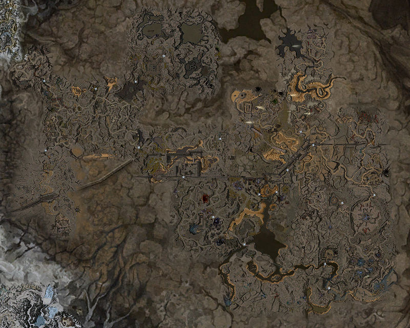
I think I prefer transparent backgrounds on the lettering (the dark background stands out...less pleasantly).
Also, if you create one more formatting template, you can use whatever colors/shading you like today...and switch it for all the maps later. Something like...
{{map lettering|background=[transparent/opaque]|color=[color]|option=[someOptions]|text=[label]}}
Or alternatively,
{{map lettering|[label]|[labelType]]|[region]}}
In the last e.g., specifying the label type determines the color (and background) for the region. In either case, instead of needing to adjust all the maps, you'd change formatting at the template. Also makes it easier for someone else to tweak later on. — Tennessee Ernie Ford (TEF) 09:05, 22 May 2011 (UTC)
- Needs a different colour for the Ascalon Arena outpost sign. Although its a pretty gay colour.. #FFCCCC has good visibility. I agree with TEF that the grey backgrounds are ugly :/ --File:User Chieftain Alex Chieftain Signature.pngChieftain Alex 11:33, 22 May 2011 (UTC)

| Outposts |
| Missions |
| Explorable Areas |
That would be my suggested layout. --File:User Chieftain Alex Chieftain Signature.pngChieftain Alex 11:45, 22 May 2011 (UTC)
- That looks pretty good. The only reason I added it in the first place was my vain attempt to keep everything uniform across all the maps. Obviously that's not going to work out very well, so if you guys would like to contribute On the main project talk page (just to keep everything together), TEF started a section about a new template structure and possibly a more automated way of making and updating the formatting and color in the future. ~Farlo Talk 19:59, 22 May 2011 (UTC)
Missing a town[edit]
Let's please swap this out for a map shot that includes Frontier Gate. 67.182.25.175 20:47, 27 July 2011 (UTC)